Designing a wine label that is captivating and convincing in the eyes of the consumer is by no means a simple challenge. Let’s think about how many times we went shopping at the supermarket and found ourselves in front of a shelf full of labeled bottles of wine.
Or how many times we went to dinner with a friend and went to buy a bottle of wine. If you are not passionate and therefore well informed about what are the characteristics of good wine, surely the attention falls on a beautiful label that can make you think that that bottle of wine is good and prestigious. It is undeniable that in many cases consumers buy with their eyes. A survey showed how consumers in most cases buy based on the choice of labels.
In recent years there has been strong growth in this sector and a winemaker will certainly want to stand out to capture the consumer’s attention and tell his story, also because the presence of other competitors on the shelf is now considerable.
DESIGN YOUR WINE LABEL
Before designing the wine label and wondering how to design a wine label, you should know your audience in order to better position yourself on the market and meet the expectations of your target. It may seem trivial to you but between a 20-year-old boy and a 70-year-old adult, there are many differences in tastes and habits.
A young person could be more easily captured by an innovative and fresh label with colors that stand out the bottle because in some cases it is kept as furniture or even used as a bedside lamp. An adult, on the other hand, is looking for elegance and classicism, so the wine label must have a classic font and a soft color. The bottle of red wine will surely come with a black or white label with some details and a classic shape.
COLORS TO USE
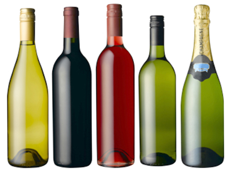
Red wines are often sold in dark green bottles to protect them from sunlight and prevent oxidation, while whites are sold in clear or light green bottles. So the color you choose you to have to make sure it will appear on the bottle where the wine will be sold.
Reds usually have two color combinations: dark and deep colors or a white label with ink-rich colors (red, blue, or gold); White wine labels tend to prefer golden and in any case clear colors, creating airy or sparkling sensations. Of course, what I am writing about are traditions that may very well be revised and changed.
In recent years, winemakers have started to get more creative with their color schemes, pairing bright or dark labels with whites for a bold, contrasting effect, or choosing a full spectrum of vibrant colors to make a red more playful.
STYLES TO USE
On a label with a dark background, you need to make sure that the Font type used is strong enough to highlight your design and create contrast. The more traditional wineries use styles that evoke their origins and their history, highlighting their authenticity. The fonts used are a Serif or in any case a Script. Modern wineries are opting for a label with brighter colors or bold, minimal faces.
We often see labels with a simple logo and a lot of white space. Instead of paying attention to the name of the winery, they put initials or logos that stand out. There are certainly different schools of thought, one classic and one contemporary, which is why I wrote earlier that it is very important to define the type of audience.
TYPE OF PAPER TO USE
The last aspect to keep in mind, on how to design a wine label, is the choice of the paper on which you want to print your label. I believe that this is the most important step of the entire supply chain and you need to be well informed about what types of paper to use and above all what the various specifications are. Imagine if after designing a beautiful label, the final consumer buys that bottle as a gift to take to dinner.
When he shows up for the invitation, he delivers the bottle that is put in the fridge because maybe he bought a nice white wine and therefore it should be drunk fresh. When it is placed in the ice bucket, the label magically comes off because it does not resist contact with water and comes off. This would certainly suggest that it is a poor wine and I dare not imagine a bad impression with the guests. I invite you to take a look at the page Wine labels of my site where I list some types of barrier paper and anti pulp that resist these stresses ensuring a tenacious hold even in the ice bucket.
Another article on this blog that may interest you: